Sunday, September 30, 2012

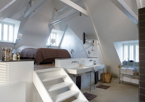
A farm house that ahs a lot to do with attic design

A farm house that ahs a lot to do with attic design

Via: journal-du-design.fr
Starfall-Farm-Invisible-Studio-Architects-2

Wednesday, September 26, 2012

A Colourful Family Home

A Colourful Family Home
This home has so much colour and vintage goodness. LOVE IT! - all photos from the blog zilverblauw


Saturday, September 22, 2012

Before-after attic office corner

Studio office before - after

From: Designsponge.com

After seeing Dana’s 3D diamond wall pattern last week, I’ve been brainstorming all the ways to add cool sculptural elements to my walls. I love wood paneled walls, but this awesome studio renovation from Cheryl Andrey is making me seriously appreciate the look of wood alone. I can imagine this looking nice as an all-wood wall, but Cheryl’s made a far better decision in breaking up the wood with stripes of blank white. It provides more light and more interest and takes advantage of the angled wall in an unexpected way. Also - using the wood as a place for pinning images? Genius. Awesome job, Cheryl! - Kate


Time: Two weeks (on free nights & weekends).
Cost: $250 (drywall, insulation, primer, paint, lathe for the accent wall and some wood and brackets for the shelves).
Basic Steps: This was the first room that my husband and I have finished completely in our 1920 house after just moving in around Thanksgiving. One of the most rewarding parts of this renovation was pulling down all of the carpet squares that literally covered every inch of the room, ceiling and floor included. Once that was gone, it was apparent that the plaster on the slanted wall was not repairable, so we took our first step into the world of drywall guided by our more experienced friend, Ryan, who has been renovating his own old house. The mudding was tricky, not only because it was my first time, but because I was attempting to match the original curves of the corners. I would say that was the most time consuming element of this project. After that, it was all prepping for painting, sanding, sanding, sanding and filling in the gaps between the molding and the walls.

When we demolished the original plaster wall, I had the idea to use lathe as a sort of pin board in the room. Unfortunately the original lathe that we removed was far too dirty to try and re-use. We completed the whole wall with one bundle of new lathe from the hardware store. I absolutely love the way it looks. It makes the room. I can’t over emphasize the impact made by just painting the room white. Since it’s my studio, it was really important to me to have a light working space. I was worried that we weren’t going to be able to achieve that without installing more lights, but the white really brightened up the room. Our plan for the future is to install a skylight on the slanted wall, but that’s for another day when there isn’t snow in the forecast.

The best tip I can give for a project like this is to not be afraid to try new things. We had never attempted to install drywall before, but we did a great job with it, and I now I feel 100% confident that I could do it again. If you’re not sure what you’re doing, don’t hesitate to check out a book or Internet resource. I purchased the 3rd edition of the book Renovation by Michael Litchfield, and it has been an amazing source of information for us as old-home owners. - Cheryl


Friday, September 21, 2012

Open Attic Spaces

Open Attic Spaces


(obliteratedheart)


(king design)


(airbnb)
(freshome.com)


 (pinterest.com)


(google.image)


(pinterest.com)


(pinterest.com)


(pinterest.com)


(houzz.com)


(houzz.com)


(houzz.com)


(decorology.com)

Thursday, September 13, 2012

Mini-Loft in Prague – Czech Republic

Mini-Loft in Prague – Czech Republic
via ArchDaily
pictures Filip Slapal

Why minimalism is so fashionable nowadays? Because space is luxury. The fewer furniture and interior decoration an apartment has the more spacious it is. Architect Dalibor Hlavacek was very aware of this fact and used only high quality, natural materials as decoration in this mini-loft in the Czech capitol. The apartment is located in Bubeneč Prague district in a corner apartment house built in the thirties. The duplex apartment is spanned with an open gallery that gives space to the study; while the living room and kitchen are two-story, the bedroom, bathroom and toilet are taking place on the second floor.


1333162766-terronska-04-750x1000

1333162649-mainimage-terronska-01-750x1000

1333162832-terronska-06-750x1000

1333162962-terronska-09-750x1000

1333163442-terronska-11-750x1000

Wednesday, September 12, 2012

Space-saving attic living room

Space-saving attic living room

From: house to home.com.
Chosen by Ideal Home
Photograph by Simon Whitmore
Here are some great ideas regarding attic decorating.

Cotton fabrics in neutral tones create a snug space - perfect for a cosy attic living room. Make over floorboards with a coat of white paint, and add an inexpensive jute rug to muffle footsteps. Find a similar rug at IKEA.
Space-saving attic living room | Makeover your attic room in 5 steps | Attic living room storage | Storage design ideas | Image | Housetohome

Invest in a sofabed -
If you have an unused loft room, a comfy sofabed is a great investment as it lets you turn your space into a guest room or a second living room when visitors leave. It's often hard to get bulky pieces of furniture up narrow stairs into attics, so choose a sofabed that comes in seperate pieces to be easily assembled in situ. The sofabed is from Muji

Invest in a sofabed | Makeover your attic room in 5 steps | Attic living room storage | Storage design ideas | Image | Housetohome

Plan your storage -
Make the most of the available storage space under sloping ceilings with an assortment of units in different heights. This style of bookcase, fits into an awkward space, making it a brilliant alternative to bespoke cupboards, and they're quick and easy to assemble. Customise the backs of shelves and glass cupboard doors with matching wallpaper for a co-ordinated look. Keep open shelves looking neat by storing clutter in these handy wicker baskets.
The bookcase, glass doors, and extension unit are all IKEA.

Plan your storage | Makeover your attic room in 5 steps | Attic living room storage | Storage design ideas | Image | Housetohome

Skylights are the most common type of window in an attic room and can make fitting a blind or curtains a little tricky. For an instant window treatment, make a simple fabric sail - just use two constrasting pieces of material back to back, and attach to the top and sides of the window with Velcro strips. To open the blind, simply unfasten one side and pin the corner back.
The fabrics for the blind are from Villa Nova and GP&J Baker.

 Make a simple window dressing | Makeover your attic room in 5 steps | Attic living room storage | Storage design ideas | Image | Housetohome

Choose moveavble pieces -
Lightweight multipurpose furniture that's easy to move around allows you to switch effortlessly between room functions. Look for storage trolleys on castors and large baskets for spare bedding and towels.

Choose moveavble pieces | Makeover your attic room in 5 steps | Attic living room storage | Storage design ideas | Image | Housetohome

Disguise the bed linen -
Pillow shams made in a fabric that matches your blind and wallpaper are a great way to turn spare pillows into cushions. You can put them on a sofa without them looking too 'bedroomy' and then swap the shams for pillowcaes when you have guests to stay.
Find the pillowshams at GP&J Baker, and the throw at Tesco

Disguise the bed linen | Makeover your attic room in 5 steps | Attic living room storage | Storage design ideas | Image | Housetohome

Tuesday, September 11, 2012

Old Grain House Transformed to Penthouse

Old Grain House Transformed to Penthouse
From: stylefiles.com


A broken ceiling, windows that were leaking, moldy carpets and cupboards and broken stairs didn’t stop the couple from following their dream. They renovated the place with imperatives: stick to their limited budget and keep the industrial spirit of the place.


The narrow spiral staircase connects the top floor of the factory with the old granary. The metal guardrail is the work of artist Judith Bartolani.

The kitchen (top image) is made from recycled materials. In the living room, the old flooring was removed and replaced by a layer of concrete poured directly on the bricks.


From the terrace the city as well as the sea can be seen.